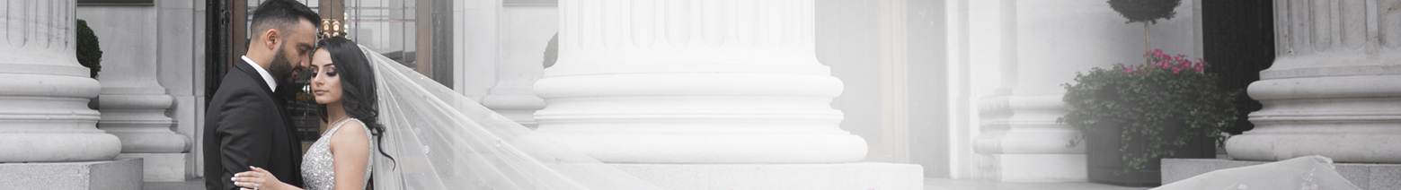
Wedding décor trends, much like fashion, are as fleeting as they come. Remember the moment with minimalist mason jars? Or couples veering towards those maximalist “Live, Love & Laugh” LED signs that overstayed their welcome? Truth is the boundary between on-brand and outdated can blur faster than a guest’s memory after an open bar. So, as the design carousel spins into a new season, we’re faced with the perennial question: what aesthetic deserves a permanent spot at your celebration and what needs to be lovingly escorted to the exit?
In the upcoming season, the décor landscape isn’t just about chasing something new, but about recognising what’s genuinely enduring. To help you separate the keepers from the clutters, we reached out to Timmy Kader of 1SW Events. The pro is known for her breathtaking floral artistry and culturally rich style that spans numerous South Asian weddings and venue transformations across cities. With a diverse portfolio, bridging London’s grandest ballrooms to intimate cross-cultural affairs, proves that the best décor isn’t dictated by trends, but by the personal stories it brings to life. Ahead, she shares a forecast on what’s hot and what’s not, with a vision board for you to borrow some inspiration.
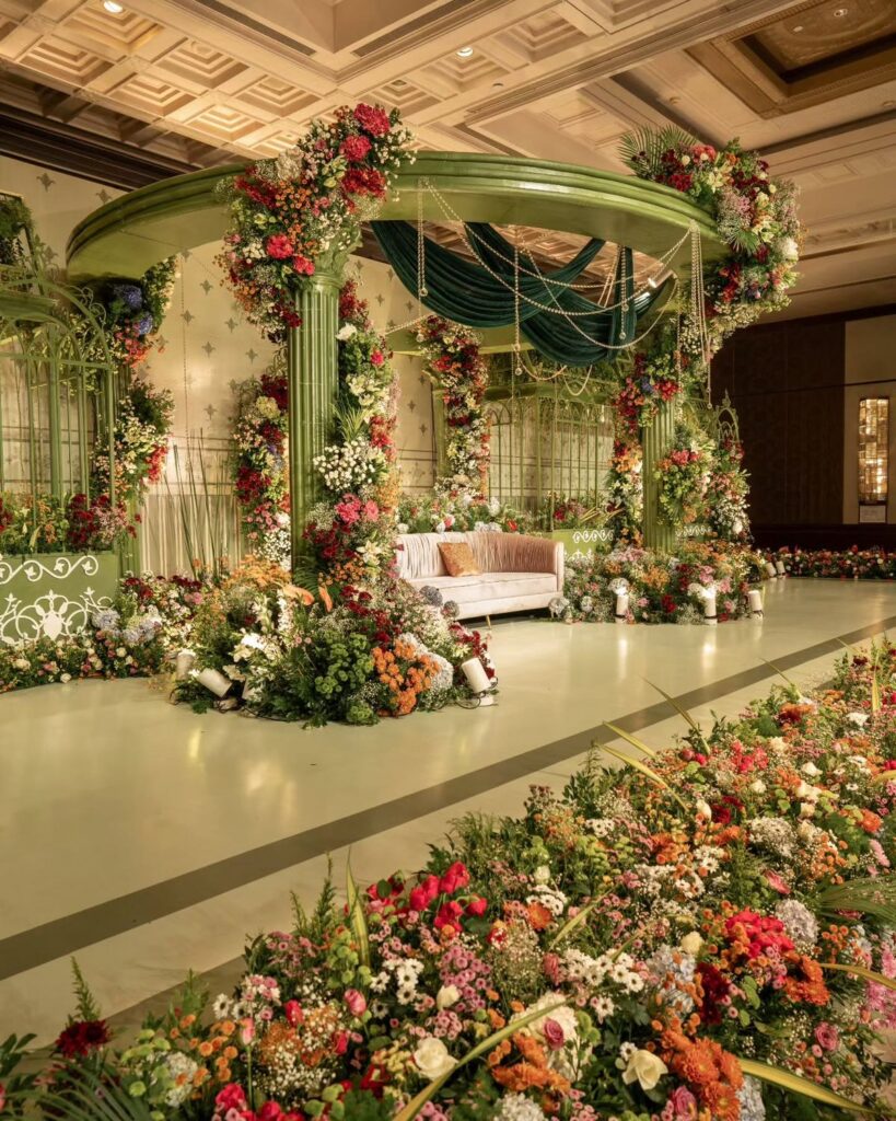
What’s In: Bold Colour Stories That Actually Work
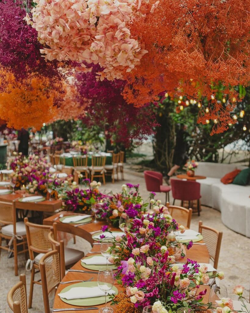
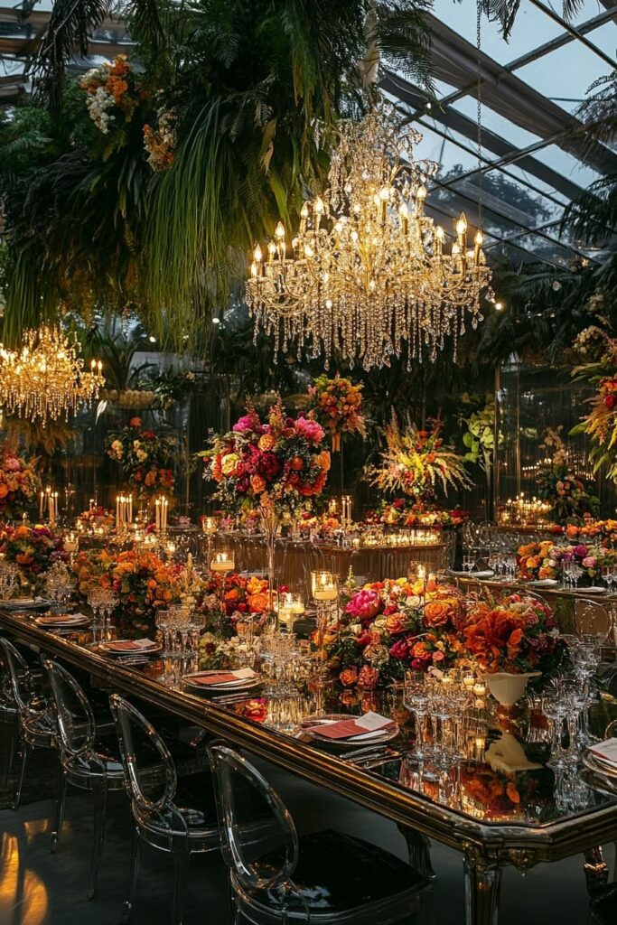
Gone are the days when playing it safe meant staying in the neutral territory. This season Timmy is seeing “couples embrace bright colours.” But it’s all about strategic brilliance, not chaotic carnival vibes. “Most venues are white, so I urge couples to bring colour into those spaces,” she suggests. The magic happens when you blend bright hues with muted tones for depth that feels intentional rather than accidental. “Take Taylor Swift’s proposal aesthetic for example. It was organic but still gloriously multi-hued. For some of our upcoming events, we’re working with coral and orange paired with soft peaches, and vibrant pinks tempered with dusty roses.” The key is restraint. Save those show-stopping brights for your mehndi or sangeet, then sprinkle them sparingly throughout other events as accents. Small attention-grabbing colour doses? Absolutely. Highlighter hues everywhere? Hard pass.
What’s Out: The All-White Aesthetic That’s Too Vanilla
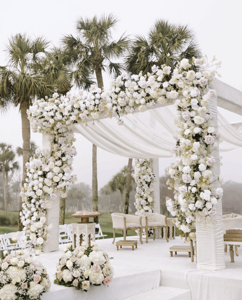
If I had a dollar for every all-white wedding I’ve seen in the past two years, I’d probably be able to fund someone’s entire mandap budget. While the pristine white paired with metallic tones had its moment (circa 2023, to be precise), Timmy’s calling time on this trend. “People are quite bored, so no more all-white, please,” she urges. The problem isn’t the achromatic palette itself, but the lack of imagination that comes with defaulting to white everything. When every flower and fabric blends into vanilla monotony, you lose the opportunity to create visual interest or showcase your personality. “Instead of falling into the trap, use colour to transform your venue’s existing scheme, which in most likelihood be white. Consider it your canvas to put your personal stamp.”
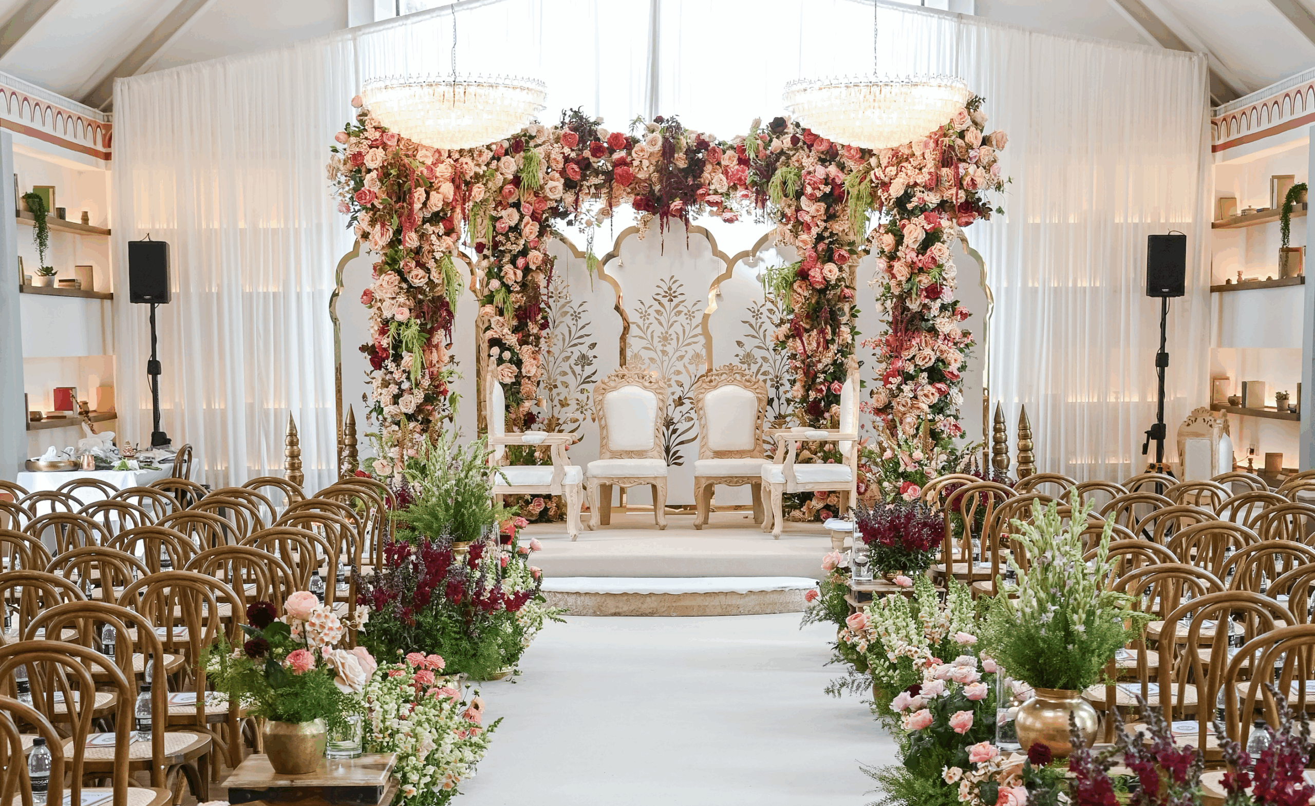
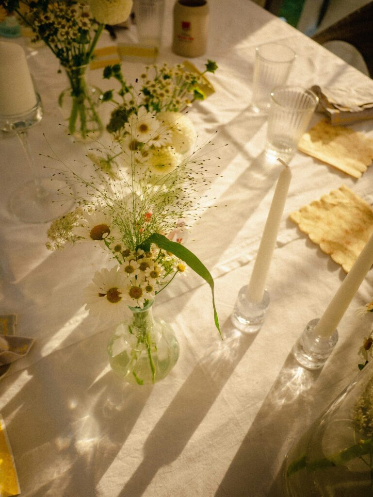
What’s In: Florals That Don’t Drown In Greenery
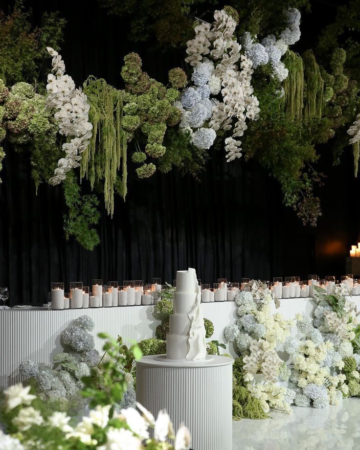
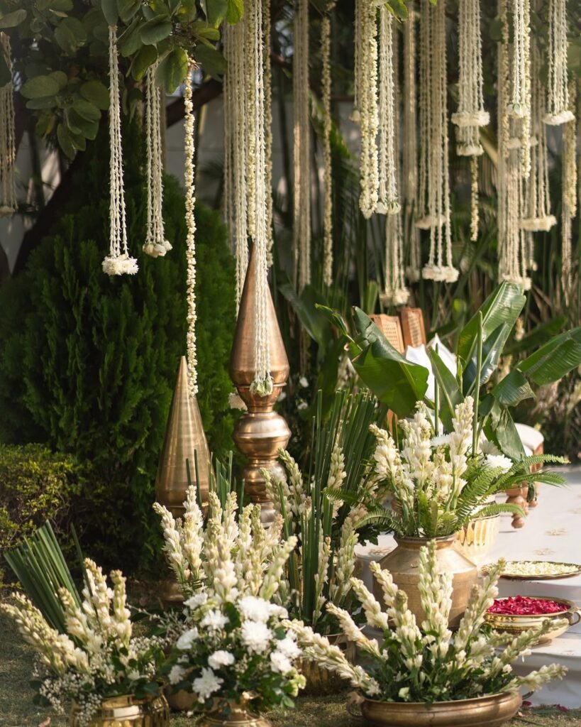
Speaking of a hot take that might ruffle some petals, Timmy says, “Your flowers should actually be visible. We strive to make florals pop rather than disappear into a sea of foliage. You will be surprised with how striking the difference will be. Don’t drown the flowers in green, but use it as a backdrop,” she advises, treating foliage as the supporting actor rather than the star. This means strategic placement where green carries your colour story rather than overwhelming it. “The technique works particularly well with mixed colour palettes. Whether you’re planning your ceremony, pre-wedding events or post-wedding reception, this approach creates arrangements that look Instagram-ready.”
What’s Out: Giant Flowers That Look Gaudy
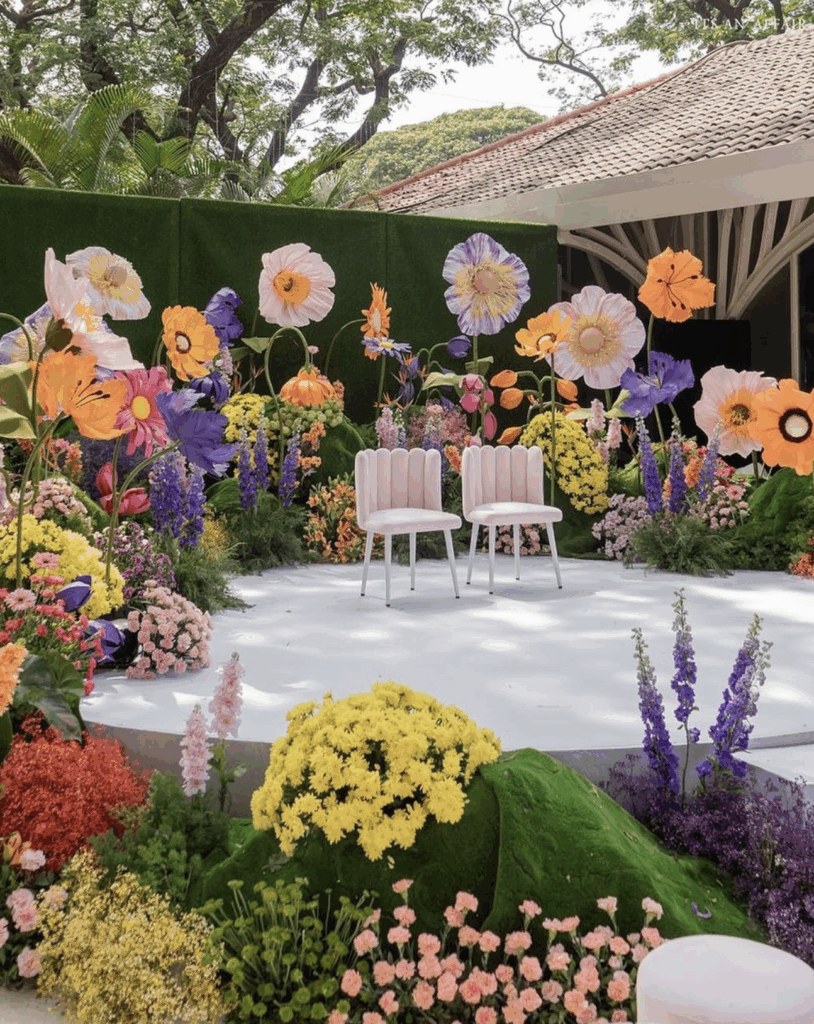
Size doesn’t always matter, especially when it comes to fresh flowers. While oversized blooms might seem dramatic in theory, in practice they often overwhelm everything else in sight. “Don’t go loud with anything especially when choosing large quantities of flowers, which end up looking as if competing with your actual celebration,” Timmy warns. The giant flower trend feels destined for an exit because, like many Instagram-driven choices, it prioritises shock value over lasting beauty. These supersized statements work better in editorial shoots than real weddings, where guests need to actually see and interact with each other across tables. “If you’re drawn to sculptural florals (and honestly, if done right, they look like works of art), commit fully or skip entirely. Half-hearted miniature versions scattered around the space miss the point entirely.”
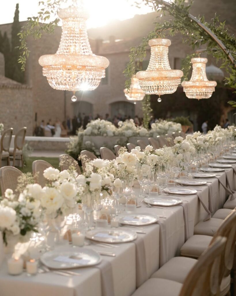
What’s In: Layouts That Transform A Space
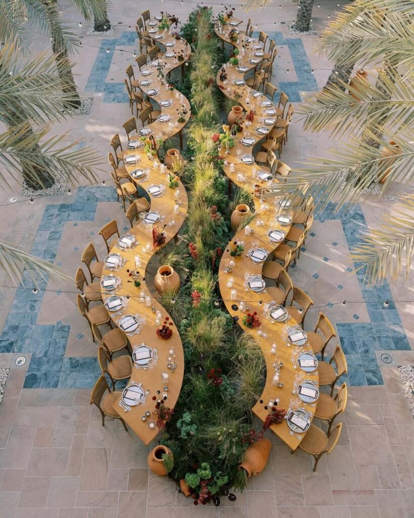
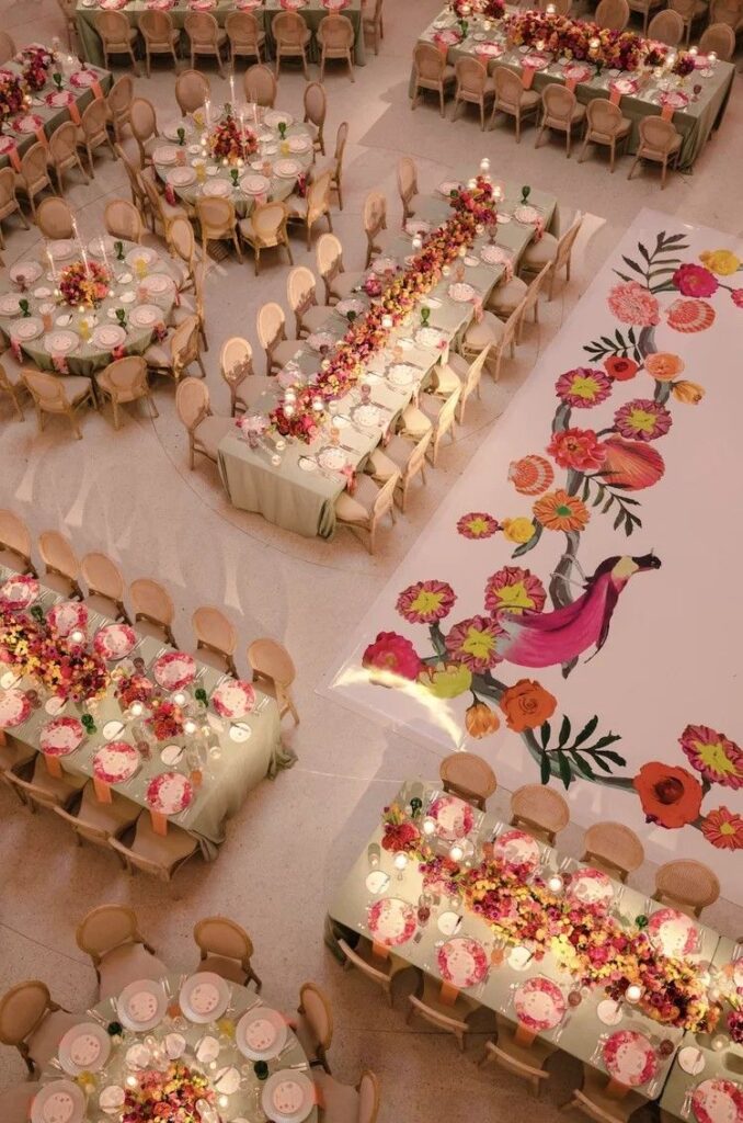
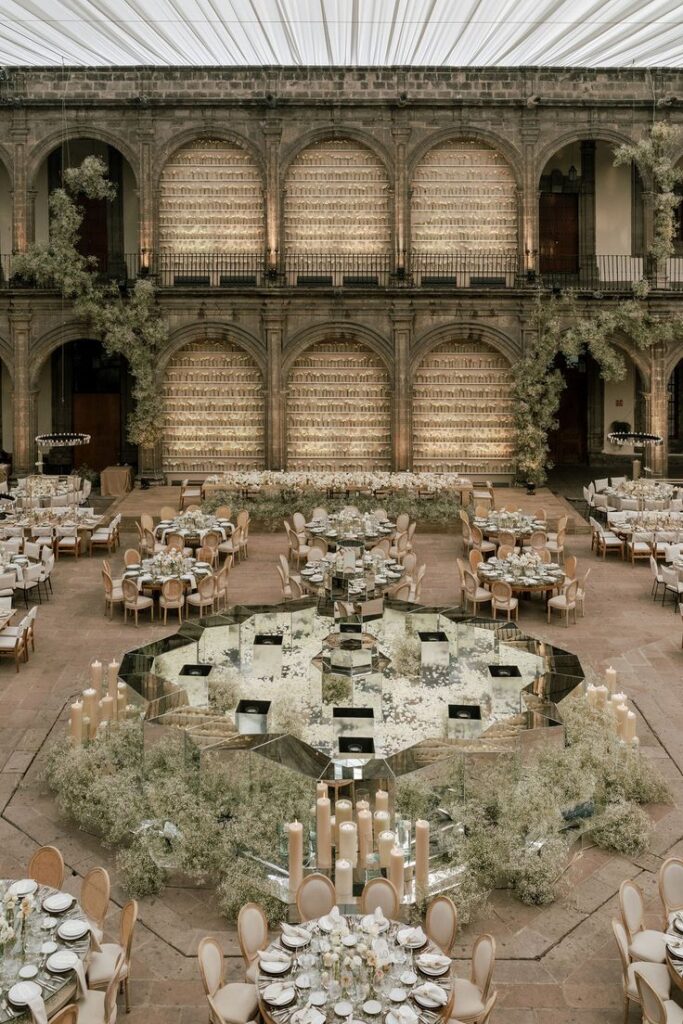
Timmy points out the elephant in the reception room: the overused seating template. Layouts, she stresses, are often ignored, yet they shape how guests experience the celebration. “Couples feel bound to the standard setup because that’s how it’s always been done,” she says. “But breaking those rules instantly makes your wedding stand out. The possibilities are endless when you consider mixing table shapes and sizes, incorporating lounge seating or adding floor-standing décor that creates zones rather than filling space. If your venue is large and you’re not using it to full capacity, this is your chance to create something that feels intentional rather than sparse.” Start by mapping priorities, be it bridal entry, cake cutting, guest flow or bar access, then build your layout around these moments. “Your designer should also consider catering logistics and guest experience.”
What’s Out: Basic Linens That Kill The Vibe
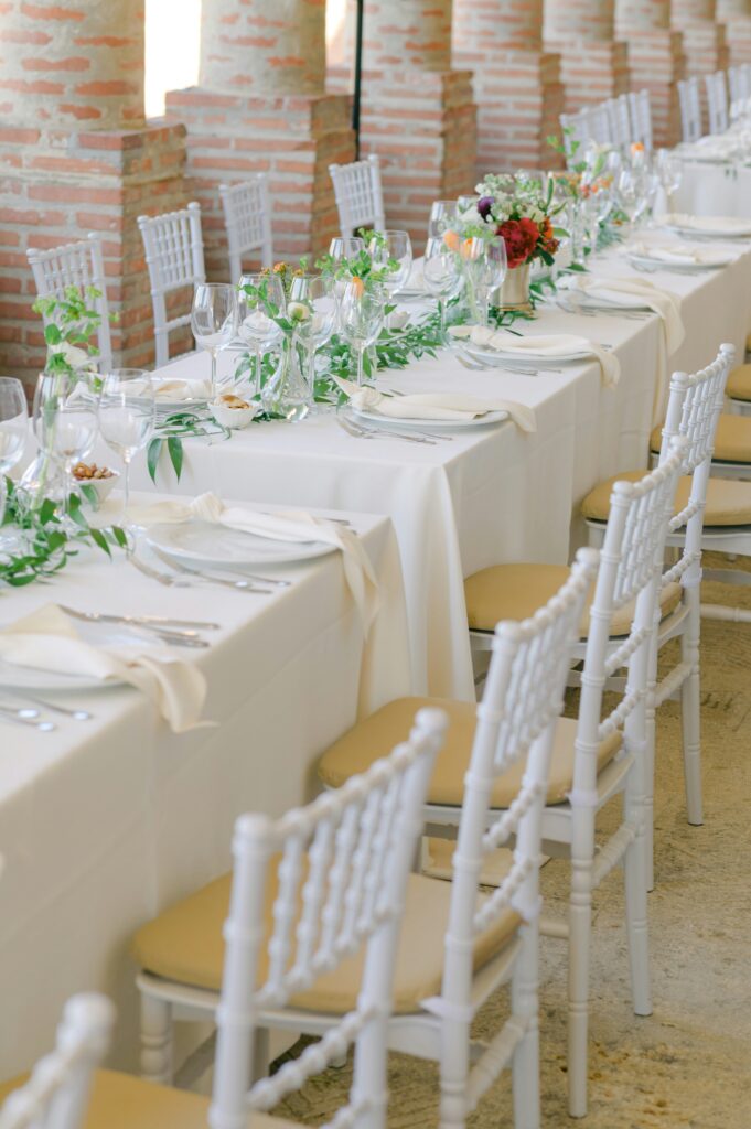
Let’s talk about the silent killer of wedding aesthetics: basic white linens. They’re lurking in standard venue packages everywhere, waiting to drain the life out of your carefully planned celebration. “Basic white linens are out,” Timmy declares. “Fabrics are major touch points for your guests. When they sit down and feel cheap cotton fabric, it affects their entire perception of your event. Conversely, luxury fabrics with interesting textures elevate everything, how the lighting hits the tables, how your flowers look, how your photos turn out.” Timmy now works with block-printing and hand-embroidering custom linens. “Consider colour-blocking with the main table, then alternate it with textures for poser tables. Or coordinate linens with existing carpet patterns.” It sounds like a lot of work, but the payoff is enormous.
For more information:
1SW Events
www.1SwEvents.com